Sunday, March 27, 2011

Powr Mastrs: Volume 1

by C.F.
published by Picture Box Inc. 2007

The 1996 Bartlett’s Roget’s Thesaurus supplies forty-seven interjections of wonder.  Allow me mentally to insert them all here.  Annnnd done.

This is really fucking great.

And I think I’m a pervert now. 

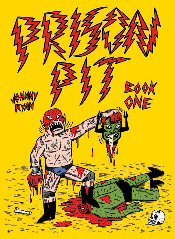
I mean I just read Johnny Ryan’s Prison Pit, in which a fuckface sucks himself off with his own slorge arm, and I thought dude I would totally suck myself off if I too had a slorge arm, and then I read C.F.’s Powr Mastrs and a gigantor jellyfish DPs a lady and boffs all over her loins and I totally almost got a boner. 

So it’s pretty remarkable how wondrously adept C.F. is at both writing and drawing.  His pictures are worth a thousand thousand words & this wee 120 page tome feels as dense as any three inch thick epic.  Matt Seneca writes with virtuoso technical acumen about C.F.’s art here (I’m waiting until after I write this post to read Seneca’s interview with C.F. at the Hooded Utilitarian), and I think I totally agree with this excerpt from Sean T. Collins’ 2008 post:

For all that characters like Subra Ptareo may be on a quest and Mosfet Warlock may be a mad scientist, their interlocking stories (so far) don't read like the genre narratives of my youth beyond their fantastic trappings at all. Instead, they're stories about buying things and selling things, about twentysomethings (or at least twentysomething analogues) meeting new people and flirting with them, about getting stoned, about fucking and deceiving the people you fuck, about being moved to tears by the realization that you're actually good at what you've chosen to do with your life.

And in my cognitively deficient parsing, Mosfet Warlock is the crux of the comic.  He first appears on page forty-seven in “Disfigured Leak” looking like a young nosferatu.  And he waves at us.  Hi, C.F.  Then while he catches a nap, the ink from a painting snatches his mobile suit, which is a normal naked human guy shell.  Mosfet wakes, sucks the inky stuff from the suit’s butt, splurts it out into a wacky bottle receptacle, packs it up into his briefcase, and goes for a stroll. We meet up again on page seventy-nine in “Tarkey Transfer.”  Mosfet traps the “disaster of [his] blood” in a crate to keep it “stable and cold.”

So far I’m thinking this could be analogous to the artist struggling with his art over control of his humanity, sorta the art/madness shtick.  Mosfet imprisons ink in a picture to keep if from infecting his mind.  Or something.

On page 103 Pico Farad tells us the story of “Mosfet Warlock and the Mechlin Men.”  This happens in Mosfet’s “early days” & his workroom is immediately interesting because it looks mostly like an in-real-life present-day house as opposed to the stark spartanism of chronologically current New China homes, and in contrast to the meticulous construction and appearance of the other structures in this book, it’s disorderly and dilapidated.  Also I’m pretty sure it’s the first building in the book that has plants in it.  Up until now, there’s been a clear delineation between the order/disorder of the inside/outside.  With all the cracks and bugs and plants, it’s like Mosfet’s lab is being overrun.

Lemme quote some lines in full from Pico’s story, pages 105-107:

Mosfet labored endlessly in his magical laboratory.  It was a place where the assumptions of the outside world were brought to task and annihilated.  He was so consumed with weird power that he would not rest until he realized his imagination’s ultimate hopeless impossibility: to force the transmutation of dead flesh into a living metal.  A warlock like Mosfet is always interested in doing the impossible, even at the cost of becoming deeply perverse.  He could not help but become attracted to the depraved idea of death-reversal.  When Mosfet had gone as far as he could in the lab, he would go outside and wander.

I’m not all that clear on exactly how the process works in C.F.’s pictures, but it seems like Mosfet collects goo from an (bee/wasp?) insect/chrysanthemum interaction, passes it through his gadgets, and squirts out some intestiney sausage-linky stuff.  Then he does the wander thing.  Then he meditates or whatever staring at the sun, morphs into an intestine sausage-linky thing with arms and a Mosfet head (I think it’s just a meditative dream, but maybe he actually does physically mutate, doesn’t matter), contemplates the night sky (this day/night could either relate to the inside/outside/order/disorder thing, or maybe just signify the passage of time), then spits out & embraces Tarkey, the inky stuff that will later slither out of a painting & try to steal Mosfet’s mobile suit (you know, from before).  Tarkey’s face looks just like a Rorschach inkblot.

Mosfet & Tarkey return to the lab, Tarkey touches the chrysanthemums, they turn into gas, Mosfet funnels the gas into the container with the decaying corpses (I didn’t mention them yet -- they popped up earlier during the “transmutation of dead flesh into a living metal” part), the corpses transmogrify into spools that look like transformer bobbins, Mosfet plants them in the ground, they grow into Mechtembre (the Mechlin Men from the title of Pico’s story), Mosfet “overflow[s] with wonder at his success,” and the Mechlin Men drag another corpse to the lab so Mosfet can do it all again.

Phew.

So Tarkey/creativity is born of the natural world, but when it contacts/comments on that world, it changes/perverts/enhances it. This is a kind of id/ego/super-ego fuckfest, right? Wikipedia tells me this about the psychic apparatus: "The id is the set of uncoordinated instinctual trends; the ego is the organised, realistic part; and the super-ego plays the critical and moralising role." That could make C.F.’s outside the id, the inside the ego, and Mosfet the super-ego? Or Tarkey is the id, Mosfet is the ego, and we the readers are the super-ego?

Or I’m full of shit?  Even if am (let's just assume I am) laughably off-base, whatever, it’s totally fun to consider.  And I haven't thought this hard about a comic in forever.  Ever. 

And okay fine I got a boner.

Saturday, March 26, 2011

Spider-Man: Fever

Brendan McCarthy – story & art
Steve Cook & Brendan McCarthy – colors & digital FX
Steve Cook – letters
Tom Brennan – assistant editor
Stephen Wacker – editor
Publisher: Marvel Comics (Marvel Knights) 2010

I’m confused! 

There’s some enthusiastic hullabaloo about Fever, right?  Lots of people like it a lot? What the fuck did I miss?  I want to read it again to find out, but I don’t want to read it again ‘cause it’s kinda pappy crap.

McCarthy’s art is absolutely sporadically dazzling.  The coloring is trippy.  He draws nice spider webs.  Part Two is the prettiest – it sports the most vibrant colors, the most technical line work, and the most stunning layouts.  I feel like Parts One and Three are too laden with black ink, and coupled with the black panel borders, the compositions are generally muddled.  Maybe that’s an intentional sense of claustrophobia?  I dunno.

The script is schlocky, isn’t it?  Seems like a generic Sorcerer Supreme gobbledygook trip through a random abyss.  Nothing subtextually interesting going on, which is no big thing, but nothing actually interesting going on, either. 

Fuck it, I’m not reading it again.

Prison Pit: Book One

by Johnny Ryan
Published by Fantagraphics Books, 2009

So many firsts for me!  First Johnny Ryan book.  First splooge monster.  First splash page thorny alien erection.  And the last page – first…wow, awesome.

Prison Pit is what you would’ve unleashed in seventh grade if you were wickedly funny and twisted and a good drawer.  But you weren’t!  Fortunately, Johnny Ryan was.  Although I think he’s like forty.  Pff.

So some nameless alien authority figures toss our nameless alien protagonist -- let’s call him Fuckface, ‘cause that’s the first thing they call him -- down a chute to a blasted desert outback – the prison pit!  Then Fuckface just starts fucking fighting shit nonstop.  One of the authority figures who got shoved down with him, a Nazi ogre skull crusher & his ill-fated cronies, the aforementioned splooge monster – Fuckface fights ‘em all.

And that’s it, really.  And it’s glorious.  

Ryan’s art style is sorta angry gonzo middle-school reject – it’s blocky and irregular and has an etchy sketchy feel to it, and it’s also tight and refined, which is maybe a contradictory description, but that’s what I got for you.  The full color cover looks righteous & the interior is black and white, which is cool with me because I don’t wanna know the color of the splooge monster’s rocket sauce.

The final panels of prosthetic fellatio I suppose acknowledge that Prison Pit is ostensibly creative masturbation -- Johnny Ryan’s hundred twenty page opus of balls out mayhem and depravity.  Or maybe all that combative mutilation just makes a guy thirsty for a slorge beej.  Whatever, gimme Book Two.

Thursday, March 24, 2011

FF #1

Jonathan Hickman – writer
Steve Epting – penciler
Steve Epting & Rick Maygar – inkers
Paul Mounts – colorer
Rus Wooton – letterer
Lauren Sankovitch – associate editor
Tom Brevoort – editor
Marvel Comics - publisher

I rode the Hickman bandwagon hard in the beginning of his run on Fantastic Four, then sort of crashed and burned toward the tail end.  His handling of the Human Torch’s death was so forgettable that I think I don’t even care that the Human Torch is dead.  But I bought FF #1 anyway because I’m a giant tool.

And I like parts of it!

But just a couple parts. 

Mostly I don’t like anything. 

I kinda dig the cover design.  Not the art, just the design.  The bloated white FF looks cool.  And the credits page -- that’s cool, too, what with the FF imposed over the blue/white outer space.

I swear I used to like Epting’s art when he was on Captain America, but something’s gone terribly awry, this is just no good.  His faces look like they were scorched into balsa with a soldering iron.

Hickman’s script is pretty wooden.  It’s like he’s assembled some set pieces of what the grieving process typically entails (typical as far as superhero comics go).  Johnny leaves a motivational goodbye video encouraging the team to move on -- make the world better.  Ben slams the door on poor Petey -- he blames himself.  Spidey fucks with the seating arrangement -- Johnny always sat there.

I'm a catty cunt.

Tuesday, March 22, 2011

Egg Story

By J. Marc Schmidt
Published by SLG (my printing is 2010, but the original is indeterminately older)

Well fuck my cock, Egg Story is the sweetest most adorable thing ever. In sixty-one itsy-bitsy pages, Schmidt encapsulates all the tumult, tragedy, impulsivity, exuberance, and raw emotion of adolescence (human and egg).  I guess that doesn’t sound entirely sweet and adorable.  So okay fine, Egg Story has its moments of bitter heartbreak.  And loss and death and suicide and madness and murder and disappointment.  But in a sweet and adorable way.  And there’s a ninja egg!

So first comes the chicken who lays a few eggs – sister Five-spots, brother Wonky, and brother Feather.  Then one of them fucking dies.  Remaining two get packaged with Bumply, Cloud, Shelly, and Connor, and the half-dozen get bought by a woman and stuck in her fridge.  Then one of them fucking dies.  Remaining five get up to some righteous pre-teen hijinks.  Then two more eggs fucking die!  Lots more shit happens. You should check it out yourself.

Schmidt’s perfectly complementary spidery lines are as delicate and brittle as the shells they depict & create a thick sense of tension -- fucking be careful, you could break at any time!!  And Schmidt evokes a whole lotta emotion with those skinny little strokes.  It’s pretty amazing how immediately his endearing eggs can be.  I mean, I eat eggs.  But I wouldn’t eat these ones.

Also I totally appreciate how Schmidt veers away from schmaltz.  His script is cute but cutting.  There aren’t many human characters, but they’re all adult, and they’re almost all kinda awful.  The farmer’s cruel mostly because we feel bad for the egglings, but the woman and her dude, they’re just nasty.  Our eggs at least are searching for some sort of meaning in their fragile existences.   Not the he and she -- all they fucking do is insult each other, callous fucks!  I dunno what that means.  Adults are bad?  That’s not it.  But kids are good.

And so is this!

P.S. It took ridiculous restraint for me to eggsclude constant Egghead puns in this post.

Sunday, March 20, 2011

Spread It On!

Noah Berlatsky writes about sound effects in Tiny Titans.  Get some!

Happy Birthday To Me

Dearest mum from whose loins I sprung not quite done, you do not yet know it, but I totally fucking bought these awesome comics for me by you.  And by ‘you,’ I mean ‘your Amex card.’  Thanks for birth!

P.S. I’ll post about’em as I read’em.

Asterios Polyp

By David Mazzuchelli
Published by Pantheon Books, 2009

After several attempts embarrassingly aborted, I finally read Asterios Polyp!  And I feel nothing!

But if I had feelings, they would feel like these.

Thank you, Geoff Grogan, for being my surrogate feeler.

Sunday, March 13, 2011

Vertigo Resurrected: Finals

Will Pfeifer – writer
Jill Thompson – arter
Rick Parker – letterer
Rick Taylor – colorer
Joan Hilty – editor
Vertigo/DC Comics – publisher

Huzzah for resurrection!

Finals was originally published as four single issues in 1999, though I hadn’t heard of it until it was re-released this week as a “100-page spectacular.”  It’s pretty killer. 

Jill Thompson’s art is cute & gonzo here. I like her delicate wispy line work, and I like how the odd angularity of her characters makes folks look creepy and deranged.  She draws really emotive faces, I like that, too.  And Taylor’s bright & poppy coloring contrasts delightfully with the often grisly & macabre plot.  I mean, the plot is funny & satirical, but there are guns and cults and scalpels so, you know, also grisly & macabre.

But Pfeifer’s script impresses me most.  And it’s his first work in comics!  I love the “message from your college president” and “who’s who” blurbs that kick off each issue, although his writing is so assured and his characterization so precise they’re almost unnecessary. 

So unhinged college president Michael Woolrich annually demands of his KSU (Knox State University, or “Kaos U,” inspired by the Pfeifer’s Ohio alma mater, Kent State University) seniors a final project worth 75% of their grade.  The push for completion inexorably devolves into a cutthroat gauntlet of no holds barred mayhem, and in gruesome Very Bad Things fashion, lots of shit hits lots of fans as graduation day approaches. 

And in the end, Woolrich says of one of his grads, he says, Can’t you see that he’s brutal, vicious, and single-minded to the point of psychosis!?  Why, he’s the perfect college graduate!  Now, go, son!  Go and carve out your place in the world!, which is a gleefully grim & misguided extrapolation of the actual Kent State University fight song:

Fight on for KSU
Fight for the Blue and Gold!
We're out to beat the foe;
Fight on brave and bold!
Fight on for victory,
Don't stop until we're through.
We're all together,
Let's go forward, K-S-U!

So yeah, the whole thing is over the top & sardonic & kind of glorious. Ra!

Saturday, March 12, 2011

Jersey Gods, Vol. 1: I’d Live And I’d Die For You

Glen Brunswick – writer
Dan McDaid – arter
Rachelle Rosenberg – colorer
Rus Wooton – letterer
Dan McDaid & Rico Renzi – TPB coverer
Jonathan Chan – book designer & producer
Image Comics - publisher

Is Jersey Gods super popular?  I feel like Jersey Gods should be super popular. It’s totally awesome.  The TPB back cover sports gushing blurbs from Chris Sims, Mark Waid, and Kurt Busiek, and they all say it’s awesome, too.  Maybe I just missed all the fanfare.

McDaid’s art is pretty stupendous.  Beyond the exaggerated Kirbyism, his style seems inspired by the very people who contribute alternate covers to this volume: Darwyn Cooke, Paul Pope, Mike Allred, and Erik Larsen. (Thank you Jesus for back cover promotional text, I don’t have to think for myself!)  That there is a righteous orgy of influence.  McDaid’s panels are chaotic and frenzied and packed with action.  Many panels do feature some cool background details, but the majority are awash with explosive coloring by Rosenberg. 

The overall effect of the art is so overwhelmingly vibrant and kinetic, you might just gloss over the words, but don’t do that, the script is equally fucking great.  Brunswick’s writing a good old fashioned cosmic love story & his characterization is unabashedly sensitive and sweet. Zoe is quirky and fun and bad at relationships and a (falsely) suspected lesbian.  Barock and Helius are like Ted and Barney from How I Met Your Mother. Only, you know, gods and stuff. 

So yeah, I’d give this a w with five es and an exclamation point – weeeee!

All-Star Chip Kidd

 Click the pic to listen & watch.

Saw this at Bleeding Cool.  What a bummer. Chip Kidd is totally Kitty Snide.  Do I sound like that when I criticize things?  I hope I don’t sound like that when I criticize things.  Henceforth, I shall make a concerted effort not to sound like that when I criticize things & I apologize mightily for any such cockish criticism I have heretofore inflicted. 

Hugs & kisses.

Thursday, March 10, 2011

Insurrection v3.6 #1

Blake Masters & Michael Alan Nelson – writers
Michael Penick – arter
Darrin Moore – colorer
Travis Lanham – letterer
Karl Richardson (Cover A) & Rael Lyra (Cover B) – coverers
Dafna Pleban – editor
Eric Harburn – assistant editor


I like this!  Insurrection v3.6 opens on Sparta in 3000 C.E., and the intro narrative is nice & concise, so here you go:

The fourth millennium has been a golden age of scholarship and philosophy.  Poverty, pollution, and armed conflict have been all but eliminated on earth.  But off-world, geo-economic blocs wage war for control of the precious silicates and ores that makes this utopian age possible.  Battles are fought… and soldiers die.

And while I’m quoting, here’s an excerpt from a CBR interview with the creator & co-writer, Blake Masters:

"The idea was to extrapolate into the future a world where multinational business conglomerates have replaced traditional nation states, and combine it with an epic 'Roman Empire' social structure, only where the role of 'slaves' would be filled by sentient machines," Masters told CBR. "The result is a world where the machines, called AUTs, are actually more human and live more vibrantly human lives than their cosseted masters who passively numb themselves with vids and exist in state of sterile ennui."

"What happens is, the large economic blocs that control life on earth, the 'Glomrat' and 'Retsu,' fight battles for control of scarce, off-world mines using their machines as surrogates," the writer continued. "Now, since no humans are in danger, the 'cost' of these battles is pure dollars and cents, a line item in the corporate budget, 'equipment lost during a hostile takeover.' So they are not 'wars' in the eyes of the corporation. The twist is, to the machines doing the fighting, it is war. Friends are killed, lovers lost. But to their human masters, a toasted AUT is the same as a broken toaster."

"Insurrection v3.6's" point-of-view character, Masters told CBR, is an AUT who rebels against this order. "The AUT messiah of this series is a Team Leader Model v. 3.6, who goes by the name 'Tim.' Ergo, he is Tim v. 3.6 and the revolution he leads is Insurrection 3.6."

That’s more than enough about the plot to decide whether or not this is your cup of revolution. It’s mine. 

The art is pretty slick & clean.  The line work is precise and almost ascetic, which suits the stark landscape.  Penick does a nice job with the spaceships and steel and cables and cavernous underground depots, and Moore’s coloring produces a delightful visual pop, particularly the outdoor/outer space scenes.  I like the circular close-up panels with the white & black border. 

And the script is really engaging.  It reminds me a lot of John Scalzi’s Old Man’s War books, which I totally dig.  Masters writes very full & natural dialogue, so where your (my) typical sci-fi adventures are bogged down by dull explanatory narrative, Masters conveys everything in swiftly flowing verbal exchanges.

And if you peel back the sci-fi, I think you’ll find some prescient points. Substitute the U.S. for Masters’ earth, and the rest of the world for Masters’ off-world, and you get the now.  The idea that wars are only wars to those fighting them echoes the disconnect between current military conflicts and the homelands that produce the soldiers who fight them.  Or maybe I’m just foolish and there is no disconnect.  Is there a disconnect?  I feel like there’s a disconnect.  Either way, Masters’ setup makes the AUTs immediately sympathetic and the humans not so much.

Wednesday, March 9, 2011

Art Baltazar Art!

Art Baltazar is so dreamy.  Couple years back, I ordered a Tiny Titans TPB from his Electric Milk Creations website & don't you know I also got some swell freebies.  Raven & Plasmus are drawn on comic backboards.  Adorable! Lunar Lizard is signed on the cover. Signed!


Tuesday, March 8, 2011

How Superman Came to Earth

Found this crumbling beauty in a library sale bin.  It's a wee 4-3/4'' W x 4'' H Random House pocket book © 1980 DC Comics Inc.  With pretty pictures!  The art credits go to Ramona Fradon and Dave Hunt. Click the pics to enlarge.

Sunday, March 6, 2011

Frank Miller on Daredevil

Probably my favorite clip on comics ever.  Frank Miller is for serious.  Click the pic to view it through YouTube & see below for my favorite lines. (Punctuated as I saw fit, motherfucker!)


“And this guy Daredevil, I kind of dug him, ‘cause, well, how many superheroes are known for what they can’t do? ... Daredevil, he’s blind.  He can’t see. That’s his distinguishing feature."

"So I think religion and politics both have a very profound relationship to comics because cartooning is taking reality and making it more so."

“What I’m after when I draw my pictures is I’m after is your guts. I want you to feel something.  I don’t want you to like me necessarily, the same with my characters.  And what I’m after when I draw is evocation.  It’s not pretty.  I love beauty.  I don’t care about pretty.”

“There was a lot of ruckus when I was working on Daredevil as it found its voice because the violence was so harsh, because people were getting cut up.”

“In comics, in comic books, in superhero comics, people have wasted an awful lot of creative energy and hard work looking for kids who aren’t there.”

“Matt should have been a villain.  He had a horrible childhood. His romantic life is the worst!  Oh sure, the girls look great, but they end up dead or killing him or something.”

“With Born Again, what I was really after, it was I think the first of a series of works that I’ve been involved with where I’ve looked at taking the machinery of the hero apart and putting it back together in leaner form, so it was more pure.”

“This lawyer vigilante thing, I mean, it’s always been shaky.  It’s a fun contradiction, but it’s a contradiction, and so I thought, break it down, destroy him, and then have the real deep hero emerge.”

“I thought there was something stupid about the way superheroes always had these normal girls for girlfriends – why? I mean, why would there be a Lois Lane to Superman.  Why wouldn’t he be running around with Wonder Woman? I mean, she can match him.  Why wouldn’t these people be operatic in their romance the way they are in their combat?  I mean, is there anything more insipid than seeing some superhero in a love scene, and all of a sudden he’s just another guy who looks like us, in a bed, naked?  No, these people would bring down buildings with their passion, that’s what they do with their fights.”

“He was not known as the most brilliant achievement of the Stan Lee regime, okay.” On Kingpin

“Light him.  You’re the guy who does the lighting.” Also on Kingpin

“Bullseye is the ultimate bad boy.  He’s a psychopathic killer, yes, but he’s really good at it, and he’s really smart.”

“I don’t think the symbolism of that sai going through her was lost on much anybody. I mean, it was rape-murder in a superhero comic, it was pretty weird.”

“What’s done by the hand in comics is something that movies cannot approach. We’ve felt so long like we were the retarded little bastard nephew of media that we’ve forgotten that we’re better at certain things than they are. And yeah, movies are much better at a bunch of things. Movies are much more powerful.  Movies control pace. A cartoonist has to be really smart to slow you down. A filmmaker just has to leave the camera where it is for a long time.  And it’s a different set of virtues and weaknesses.  So yeah, I came in wanting to make comics more cinematic.  I stay in wanting to make them less so.”

Wulf #1

Steve Niles - writer
Nat Jones - peciller & inker
Mai - colorer
Richard Emms - letterer & designer
Ardden Entertainment/Atlas Comics - publisher

1975 Wulf #1
2011 Wulf #1
2011 Wulf Page 7


So I’m sort of a sucker for all things barbarian, Conan of course being my first barbarian love.  I don’t necessarily mind if they’re derivative knockoffs as long as they look pretty and read nice.  Wulf looks pretty.  And it reads nice.  Score!

I don’t know anything about the original Atlas Wulf, so I can’t make any comparisons.  The plot here is straightforward and sparse and engaging.  There’s no need to overwrite this – Wulf scours apocalyptic planet for evil, evil splashes onto present day earth, Wulf gives chase.  Niles’ script is grim but swift, and Jones’ grisly art is a solid partner.  I like Mai’s coloring. That page 7 iron maiden torture mask is cool.

So yeah, score one for barbarianism.

Axe Cop: Bad Guy Earth #1

Malachai Nicolle – story
Ethan Nicolle – pencils, inks, letters
Dirk Erik Schulz – colors
Dark Horse Comics - publisher

Yikes, this unexpectedly becomes a giant chore of a book to read after like two pages. And I read it twice to make sure! But yeah, go ahead and stop after two if you want to maintain your adoration for Axe Cop.

I am (was?) a fan of the webcomic, and I think that’s probably why this issue doesn’t work for me. Axe Cop is crazy and cute and ballistic in bite-sized portions. But this is twenty-four pages of bloat. The charm wears thin real quick.

So the initial bit with Axe Cop & Dinosaur Soldier sharing breakfast, drinking brains, searching the skyline -- that’s good stuff. They were pretty sure it was a bad guy planet.... We’d better go explode it, well, that’s just awesome.

And then stop! Stop reading!

Okay fine, I actually also like Dinosaur Soldier’s comment at the top of page three, the one where he goes, Yeah, so I can take a picture of it and take it back to the lab, just because I love the idea of the boys sitting around a folding table in some crusty basement staring at a Polaroid of a distant green planet. So read that. And then stop.

I’m okay with the art – I like the rough white outline around some of the characters & objects, it adds an interesting dimension to the panels that feature it. Page 7 panel 1, the one with Axe Cop and Dinosaur Soldier taking off through the streets, that’s a cool panel, what with the white border and all. Beyond that effect, the art is a little flat. I should be more affected by Wexter’s righteous shades and machine-gun arms, but I’m not.

And I’m a little turned off by the presentation, I suppose. The book is really packaged around the age & relationship of its creators. I know the webcomic is, too, but it feels more forced here, more like a marketing gag.

You know, I kind of feel guilty right now. How could I not like this book? What the fuck, maybe I’ve just lost my soul.

Wednesday, March 2, 2011

Herculian

Erik Larsen – methinks he did everything here
Image Comics – publisher

So this is kind of a sweet smorgasbord from Erik Larsen – an over-sized 48-page vanity publication. (I mostly mean that without malice – I do like the book, though the intro & overall presentation are a tad pompous, even if jocular.)  On the one hand, I feel like the cover is an odd marketing choice.  And on the other, it probably makes perfect sense.  The book really has nothing to do with Herculian & Punchin’ Judy, at least not in the way you’d expect, so it might turn off people who avoid bombastic superheroics, but the cover also reflects exactly what made Larsen famous, so it’s an easy draw for fans.  

Anyways, under the cover, the art is the main sell.  The written-pencilled-inked-in-a-day (the colors came later, but they are a nice touch, I like how they go outside the lines) main feature takes up the first 24 pages, and then there are a few backups to fill out the full 48.  The scripts are slight but endearing, mostly just gags that propel the images, though there are the odd giggles & guffaws.

The art here is generally loose, hurried, and frenetic, and that, I think, is the major attraction.  It’s all just interesting to look at, which I do mean entirely as a compliment.  I’m sure plenty of professional artists spend much more time on stuff much more substantial than this, but Larsen’s got pizzazz.

And Their heads are full of delicious pasta! is delightful.